Zen Data Shastra: from a basic website to a site that sells the thinking
A data consultancy with real delivery behind it had a website that said almost none of it. Here is how we rebuilt it around the question their buyers were already asking.
By Cylent Solutions7 min read
In this article
Some businesses need a website to tell people they exist. Zen Data Shastra needed one to tell people what they are capable of, which is a much harder job.
They are a data consultancy: AI implementation, data science and machine learning, data engineering, ML engineering, analytics, intelligent automation and workforce training, for clients in retail, consumer goods, pharma, media, loyalty, financial services and manufacturing. That is a lot of expertise. Their website, when they came to us, was a basic one. It put the company online and not much more.
The brief behind the brief
The obvious brief was "make the website look modern". We think the real brief was different, and it shaped every decision that followed.
A company buying AI and analytics work is not buying a logo or a colour palette. It is buying confidence that this particular team will turn its data into something that actually changes a decision. Most of those buyers have been burned before, by a pilot that looked impressive in a demo and never made it into the business.
So the website had one job above all others: to make a sceptical buyer believe, within a few seconds, that this firm understands their problem. Looking modern was necessary. It was nowhere near enough. We wrote about why in why most business websites feel outdated: a new coat of paint on an unclear site just gives you an unclear site in new colours.
Starting with the buyer's question, not the company's services
Most consultancy websites open with a capability statement. "End-to-end data and AI solutions." It is accurate, and nobody remembers it.
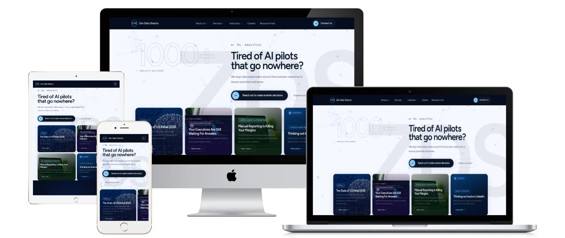
We opened with the objection instead. The first thing a visitor reads on the new site is:
Tired of AI pilots that go nowhere?
Then, underneath it, the firm's answer in one line: they align data and models around the business objective to ensure practical outcomes. Then a clear next step.
That headline does three things a capability list cannot. It names a frustration the buyer has already felt. It tells them, before they have read a single service name, that this firm is on their side of the table. And it filters: a visitor who has never run an AI pilot is probably not the client, and that is fine.
Straight after it comes proof. The firm's own count of delivered projects sits on the first screen, and the opening section leads into their published thinking on real problems, such as the state of US retail and why manual reporting eats into margins. The page claims something, then immediately shows evidence for it.
An architecture built around how buyers look for help
A data consultancy has two natural ways in. Some buyers arrive with a problem type ("we need our data pipelines fixed"). Others arrive with an industry ("we are a pharma company, have you worked with anyone like us?"). The old website served neither well.
The new one is built around both:
- Seven services, each with a plain description of what it delivers, from AI implementation to workforce training. Each one links through to related case studies, so a claim about a service is always one click from evidence of it.
- Seven industries, each paired with the outcome that matters most in that sector: demand intelligence for retail, clinical analytics for pharma, risk and fraud detection for financial services, operational efficiency for manufacturing.
- A navigation that exposes that structure at once. The main menu opens into services and industries with a one-line description beside each, so a visitor can find their own situation without guessing what a menu label means.
- A resource hub for the firm's insights, which gives the site a reason to be revisited and gives search engines a growing body of expert content to understand.
- About, story, team and careers pages, because in consulting people buy people. A buyer wants to see who they will be working with.
The result is a site where almost any buyer can answer "have they done this, for someone like me?" in two clicks.
Design that earns trust instead of decorating
Data and AI is a crowded, noisy category, full of glowing neural networks and stock photographs of blue circuitry. We went the other way.
The design is calm and structured. There is generous space, a clear type hierarchy, and a restrained palette, so the substance does the talking. Polish helps trust only up to a point. After that point, specifics do the work.
Every section follows the same rhythm: a clear statement, a short explanation, then a route to evidence. It is designed to be scanned by a busy executive and read properly by the analyst they forward it to.
And it is fully responsive, from phones and tablets to laptops and large desktop screens, because a link shared in a WhatsApp group or opened from LinkedIn on a phone is often a buyer's first look.
Built so search engines understand it
A consultancy that sells expertise needs to be found by people searching for that expertise. So search was part of the build from the first page, not a plugin added at the end. That is the approach we describe in how search engines actually understand a website.
In practice that meant a clear heading structure on every page, a descriptive title and meta description for each, clean and crawlable navigation, service and industry pages that each have one clear purpose, and a content hub that builds topical depth over time.
How the new site measures up
We tested the live site with Lighthouse, Google's open-source auditing tool, on 24 September 2026.
| Lighthouse category | Mobile | Desktop |
|---|---|---|
| SEO | 100 | 100 |
| Best Practices | 100 | 100 |
A perfect SEO score means every technical search check Lighthouse runs passes: page titles, descriptions, crawlable links, a valid structure, legible text on mobile. A perfect Best Practices score means the site follows current standards for security and modern web development, with no browser errors and no deprecated features.
On desktop the site also scores 85 for performance. Speed is never finished, though, and it matters more than most businesses think: we explain why in why website speed matters.
What changed for Zen Data Shastra
Before, Zen Data Shastra had a website. Now they have a sales tool: something that opens on their buyer's problem, shows the breadth of their services and industries in a structure anyone can navigate, backs its claims with case studies and published thinking, and passes every technical search check Lighthouse runs.
It is also a site the firm can grow into. New case studies, new insights, a new industry or service: each has an obvious place to go.
The best compliment a website can get is that a buyer never thinks about it. They just understand the company faster.
What this means for your business
If your company does serious work and your website does not show it, you are not alone. It is a common gap in growing businesses, and one of the most fixable.
The approach that worked here works for most service businesses:
- Find the question your best buyers are already asking, and open on it.
- Organise the site around how buyers look for help, not around your org chart.
- Put evidence within one click of every claim.
- Design for calm confidence, not decoration.
- Build search and speed in from the start.

Written by Cylent Solutions
A studio in Indore for web design and development, video and brand identity. We write here about the decisions behind the work, including the ones we would make differently.
Filed under Case study